


MG GARUZ
Graphic Design
& Brand Strategy
Hello there! I’m really into...
Brands that make a difference.
.


Nueva Sonik ︎Event Series & Music Collective
Branding, Social Media, Flyer, & Poster Design
Role Designer & Event Producer
Years Active 2020-2023
Location Brooklyn, NY
Years Active 2020-2023
Location Brooklyn, NY
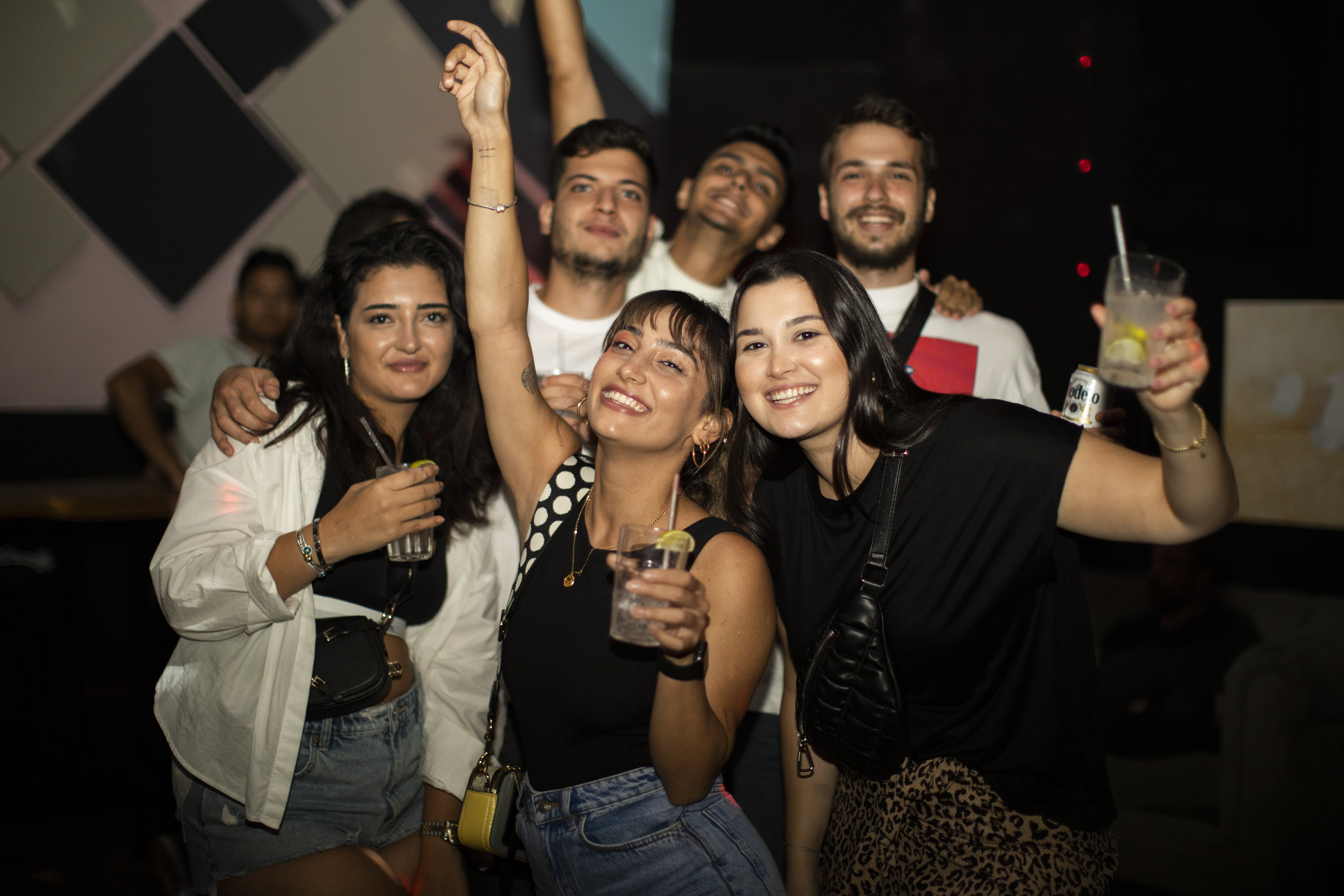
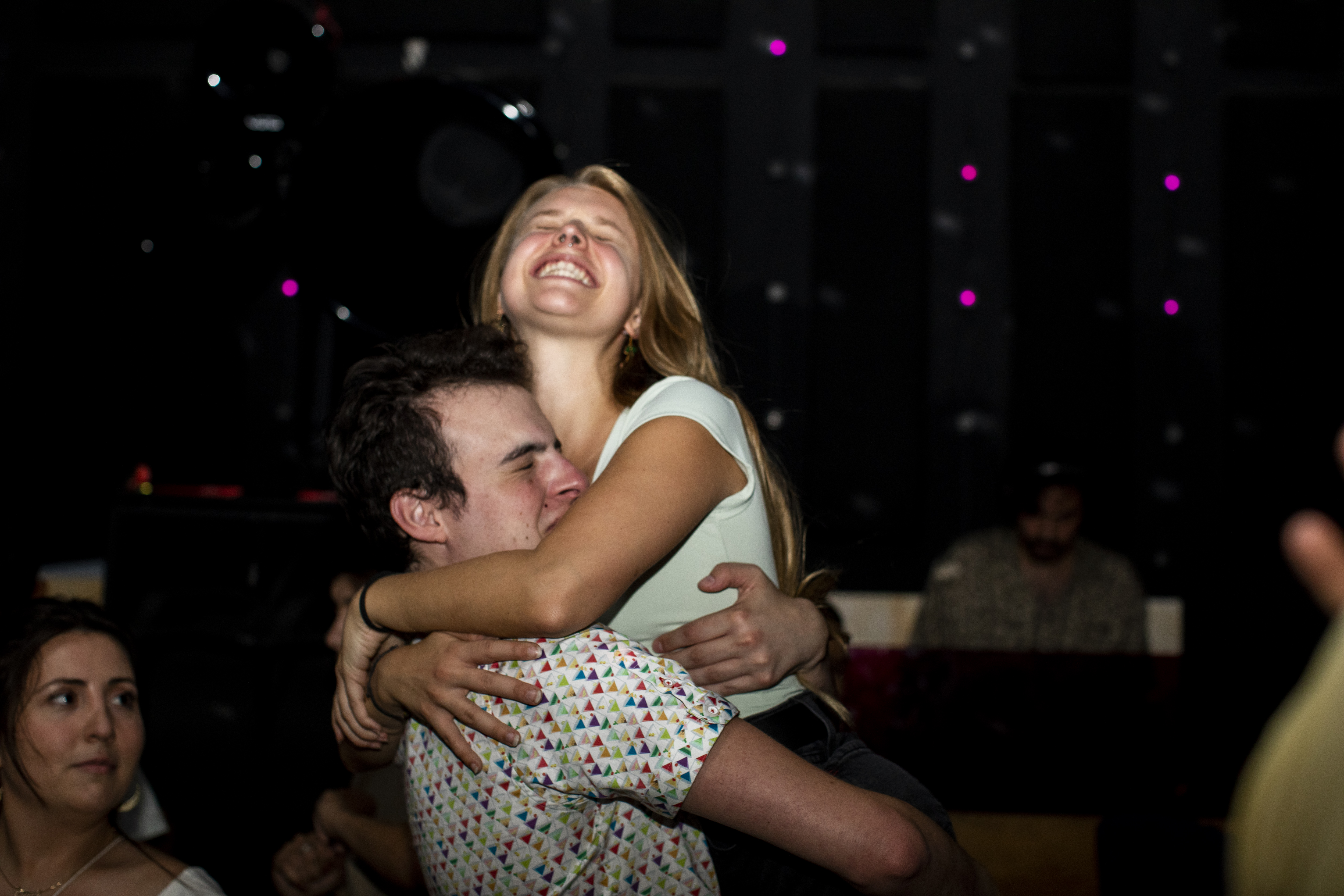
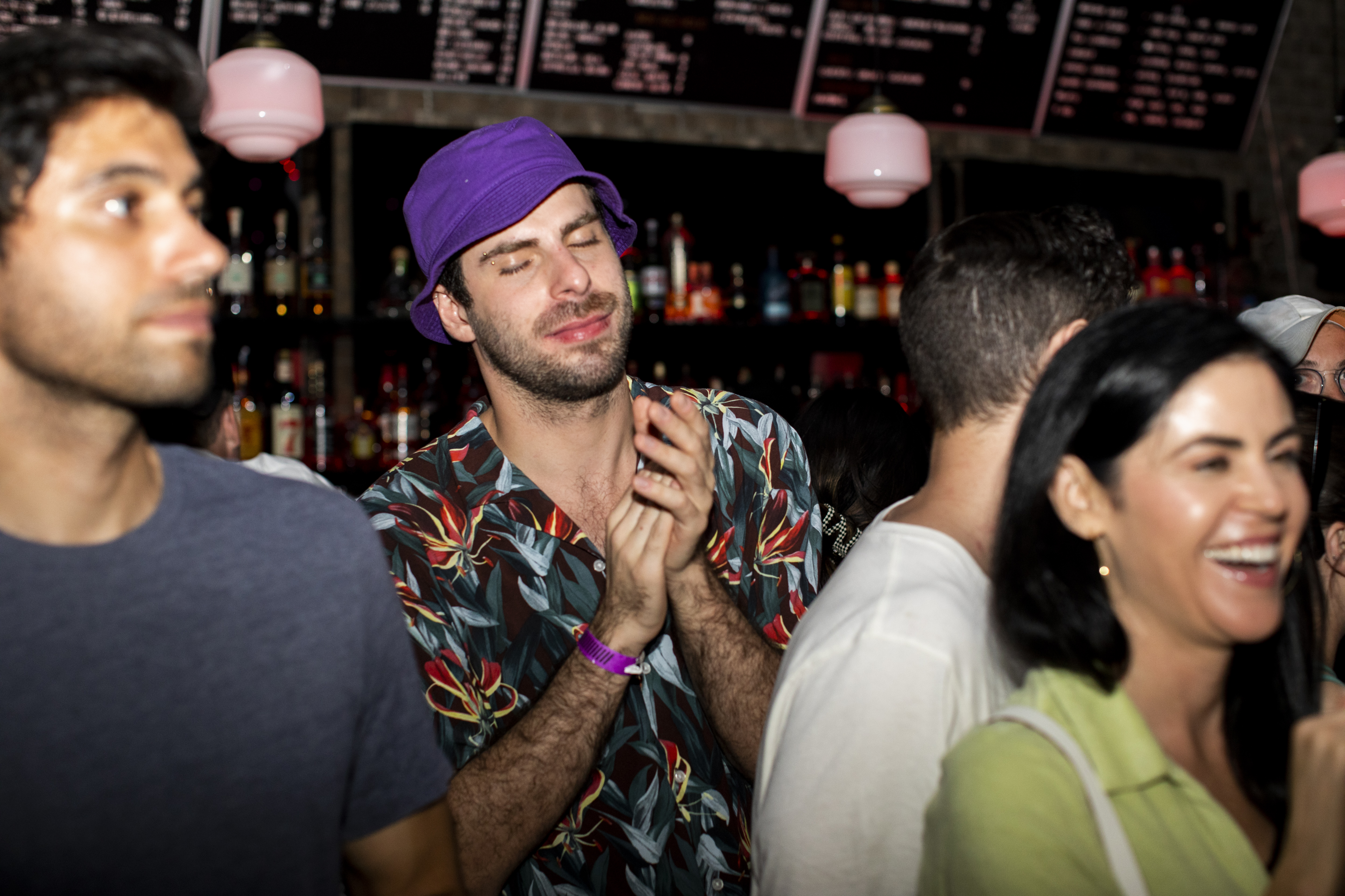
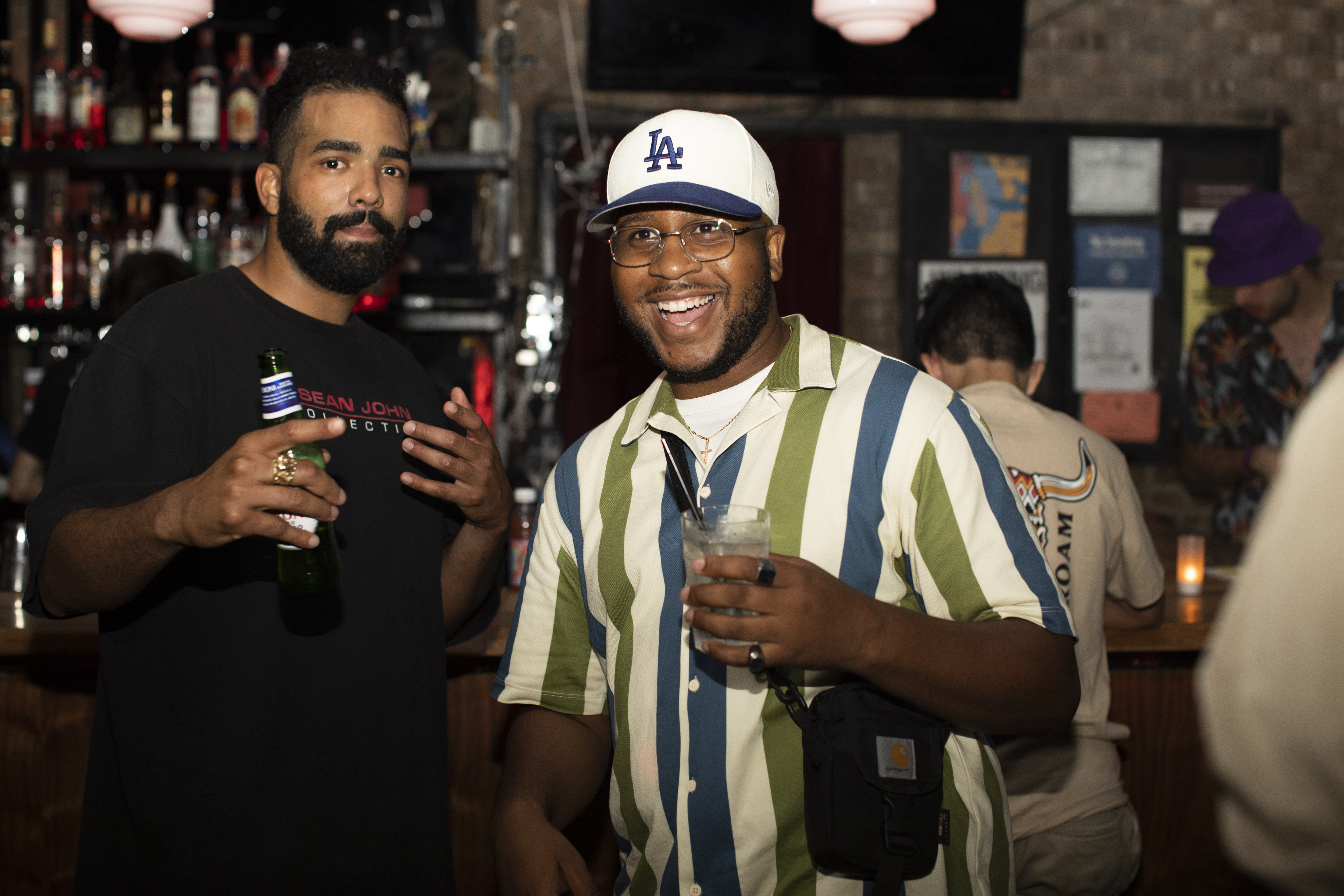
Nueva Sonik was a Brooklyn-based party series and music collective co-founded with friends. Born from a shared love of electronic music and our diverse cultural backgrounds—Turkish, Latin American, and beyond—we created a platform to spotlight artists we admired and foster community on the dance floor. Born right after pandemic restrictions were lifted, we were sparked to meet face to face and share and dance more than ever. Our group always went out together, and we had become very closely knit by sharing music during the pandemic and meeting for outdoor barbecues.
Born right after pandemic restrictions were lifted, we were sparked to meet face to face—and to share, dance, and be around each other more than ever. Our group always went out together; we’d gotten close during lockdown, trading tracks online and later meeting for outdoor BBQs and beach days. Some of us were DJs and producers, others worked in nightlife or theater, and a few were engineers or in construction—we came from all backgrounds. That mix of energy and curiosity naturally led to wanting to build something together. We’d already been doing it in a way (just more casually), and this was a chance to shape it into something more intentional.
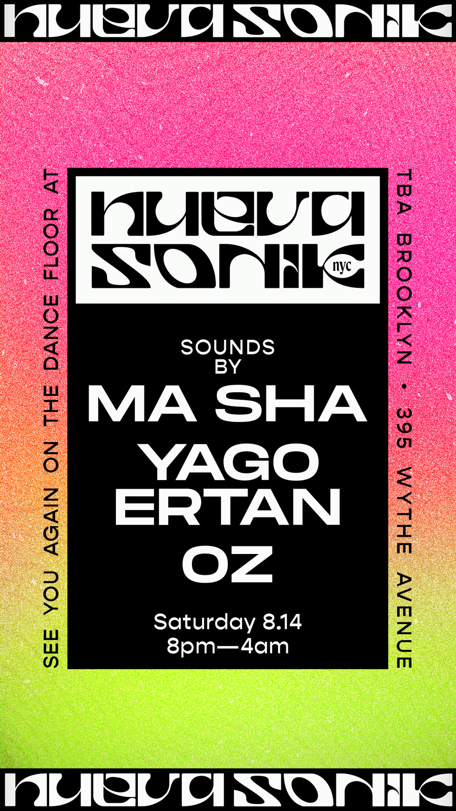
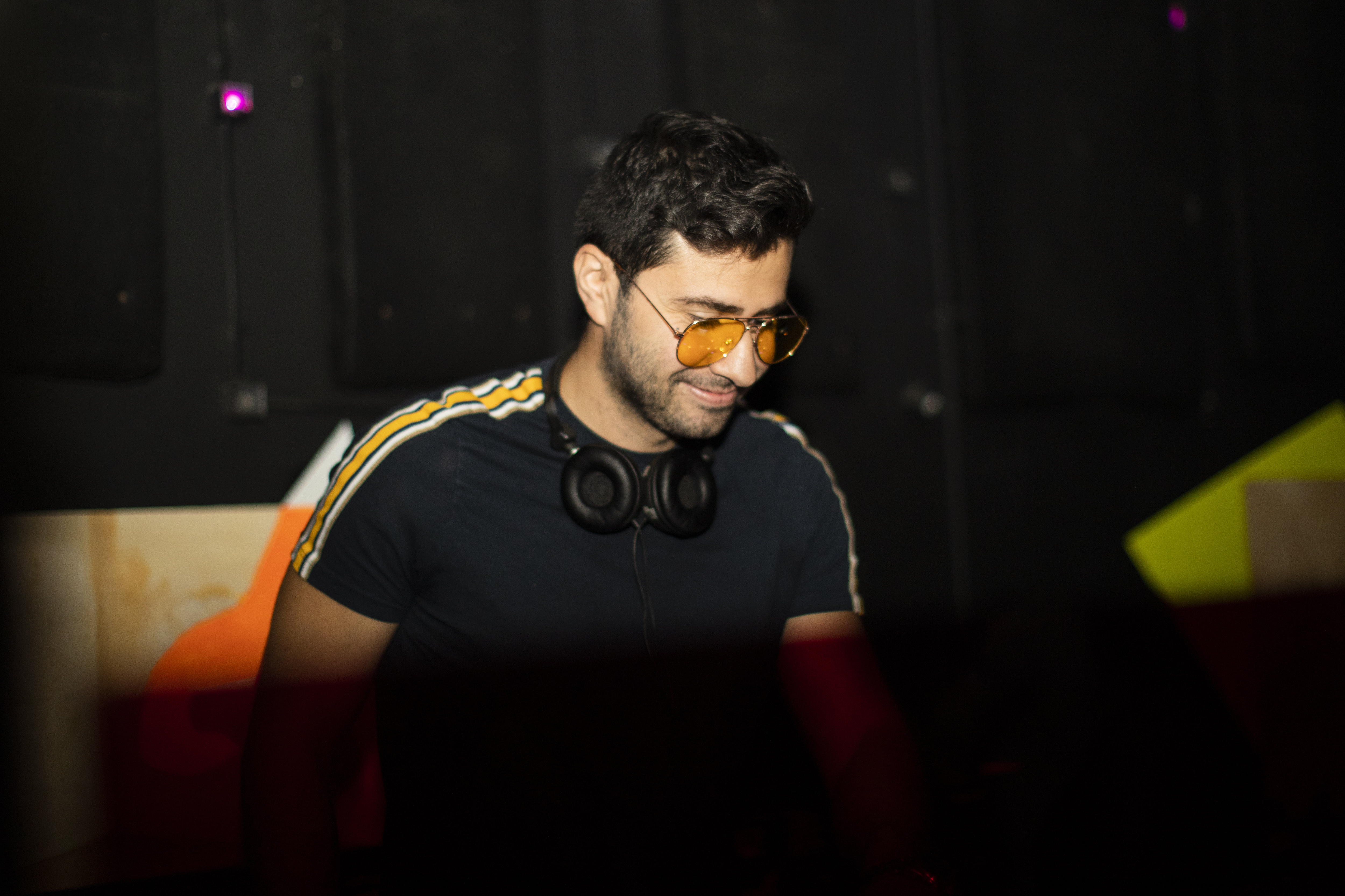
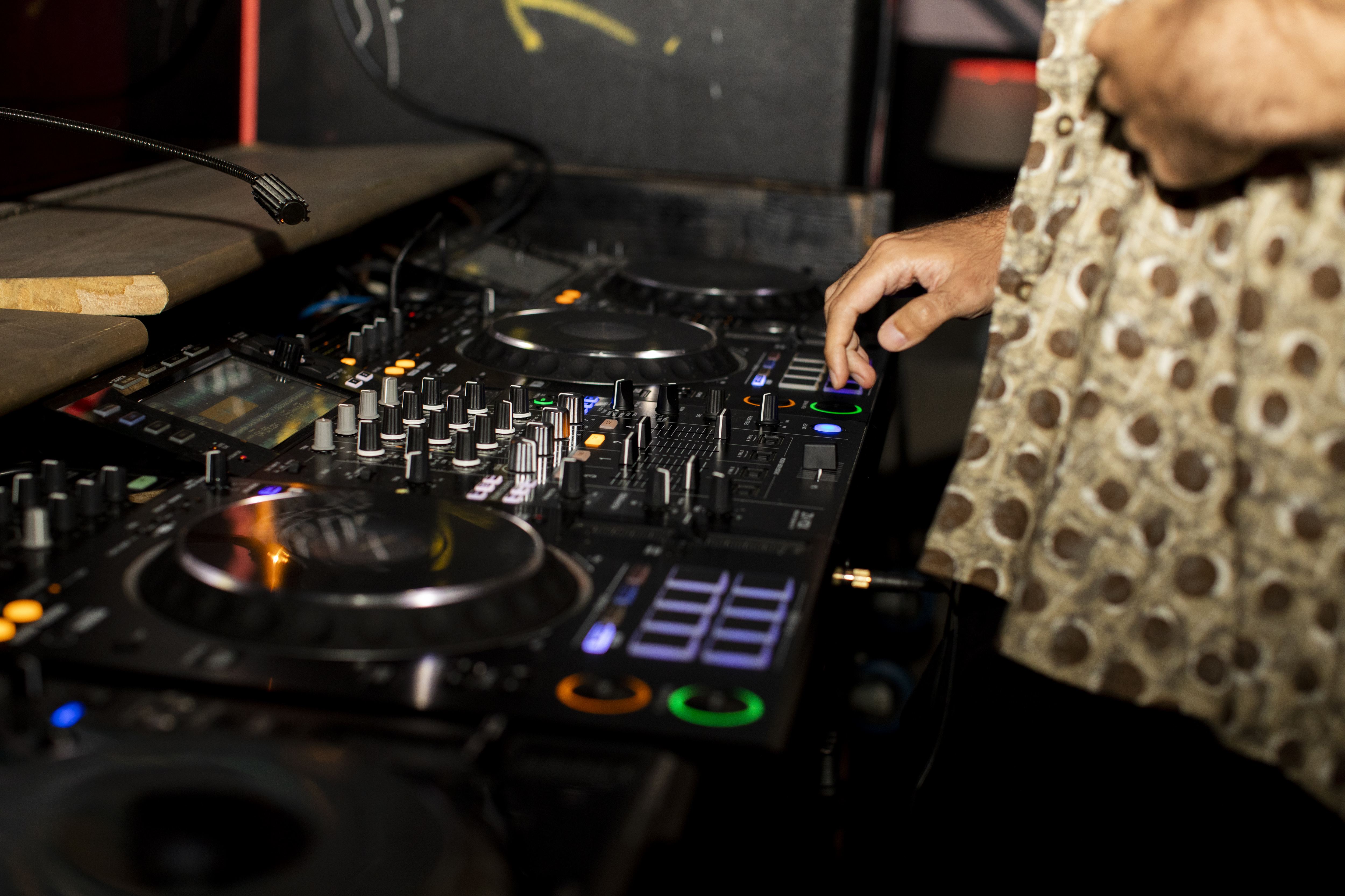
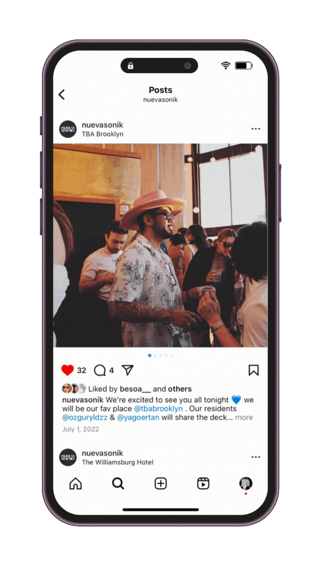
The events took place monthly at rotating venues across NYC (though primarily at TBA Brooklyn, in Williamsburg, now closed) and centered around DJ sets and live performances. We aimed to keep things open and inclusive, giving new talent a space to play, connect, and experiment.
Born right after pandemic restrictions were lifted, we were sparked to meet face to face—and to share, dance, and be around each other more than ever. Our group always went out together; we’d gotten close during lockdown, trading tracks online and later meeting for outdoor BBQs and beach days. Some of us were DJs and producers, others worked in nightlife or theater, and a few were engineers or in construction—we came from all backgrounds. That mix of energy and curiosity naturally led to wanting to build something together. We’d already been doing it in a way (just more casually), and this was a chance to shape it into something more intentional.
The events took place monthly at rotating venues across NYC (though primarily at TBA Brooklyn, in Williamsburg, now closed) and centered around DJ sets and live performances. We aimed to keep things open and inclusive, giving new talent a space to play, connect, and experiment.
Nueva Sonik emerged from questioning: how do we learn to reconnect and interact post-pandemic?

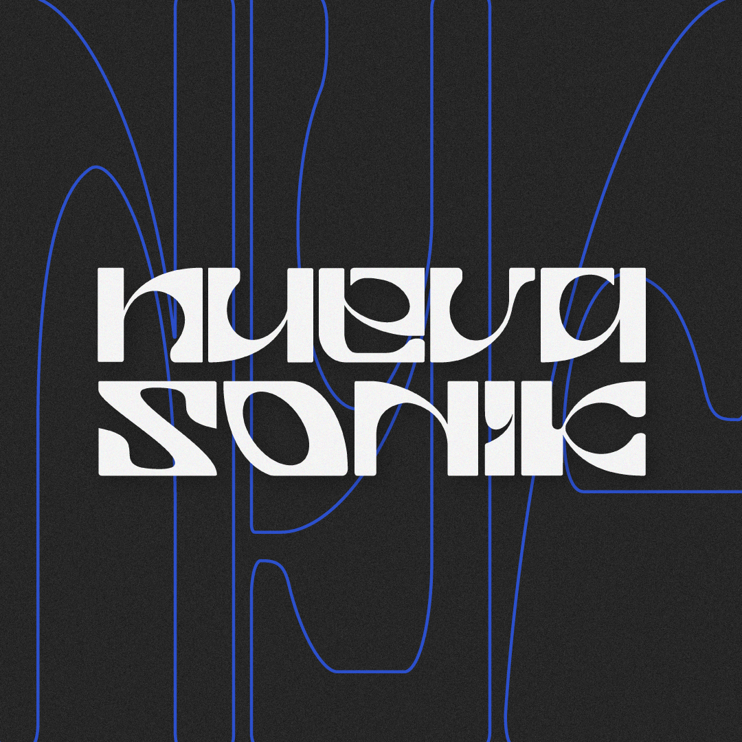
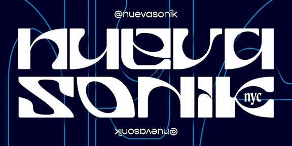
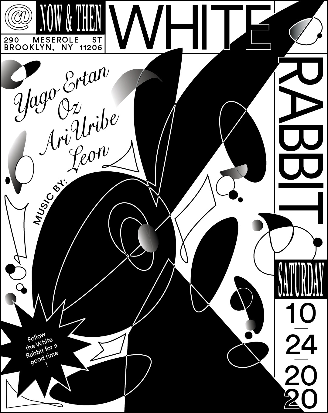
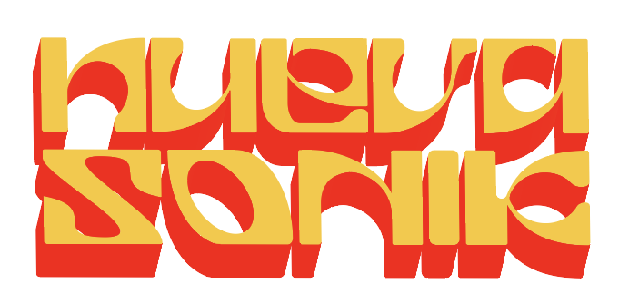
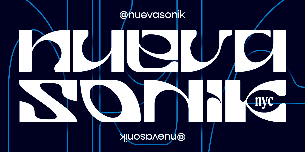
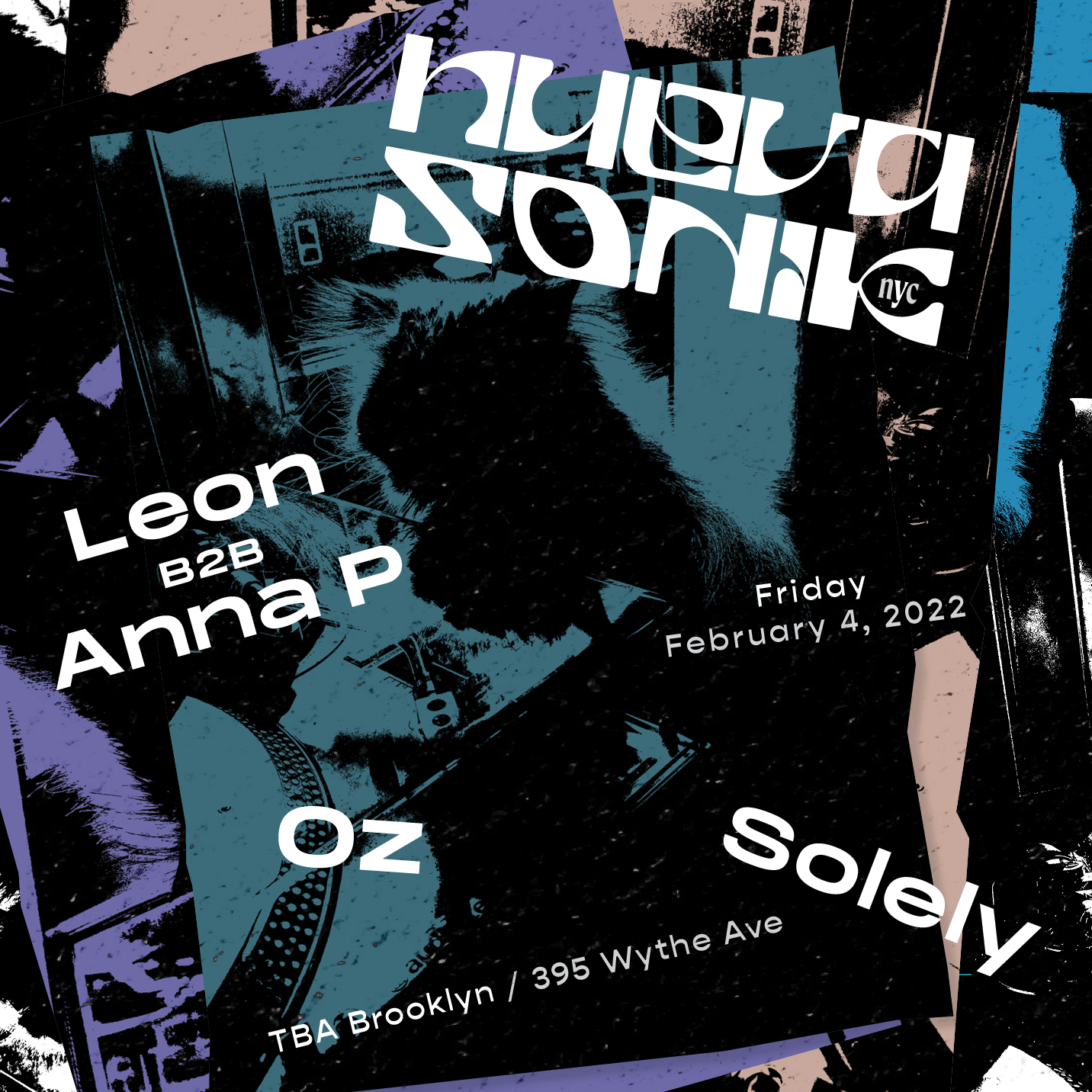
The party started out as White Rabbit—a nod to The Matrix and that feeling of stepping into something unexpected. Over time, it shifted into something that felt more true to us: culturally, sonically, visually. We called it Nueva Sónica, and eventually Nueva Sonik—a name that blends the Spanish sónica with the Turkish sonik. Friends just called it Nueva. Even though all of our events were in Brooklyn we decided to add ‘NYC’ to keep it international.


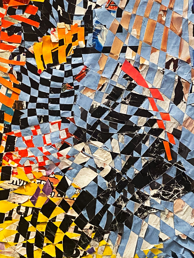
The branding pulled from the energy of NYC’s nightlife: fast-paced, flyer-driven, constantly changing. While the music leaned electronic—techno, acid house, experimental electro, the design references came from elsewhere: Turkish psych rock, design posters I admired, early 2000s rave flyers. Nueva’s visual language was a mélange of cultures like Latin, Persian, and Anatolian, music genres, and cherished childhood memories that we all share despite growing up in different places.


Some of the visual references pulled from Newyorican salsa, traditional Arabic and Persian art, and shared childhood memories.
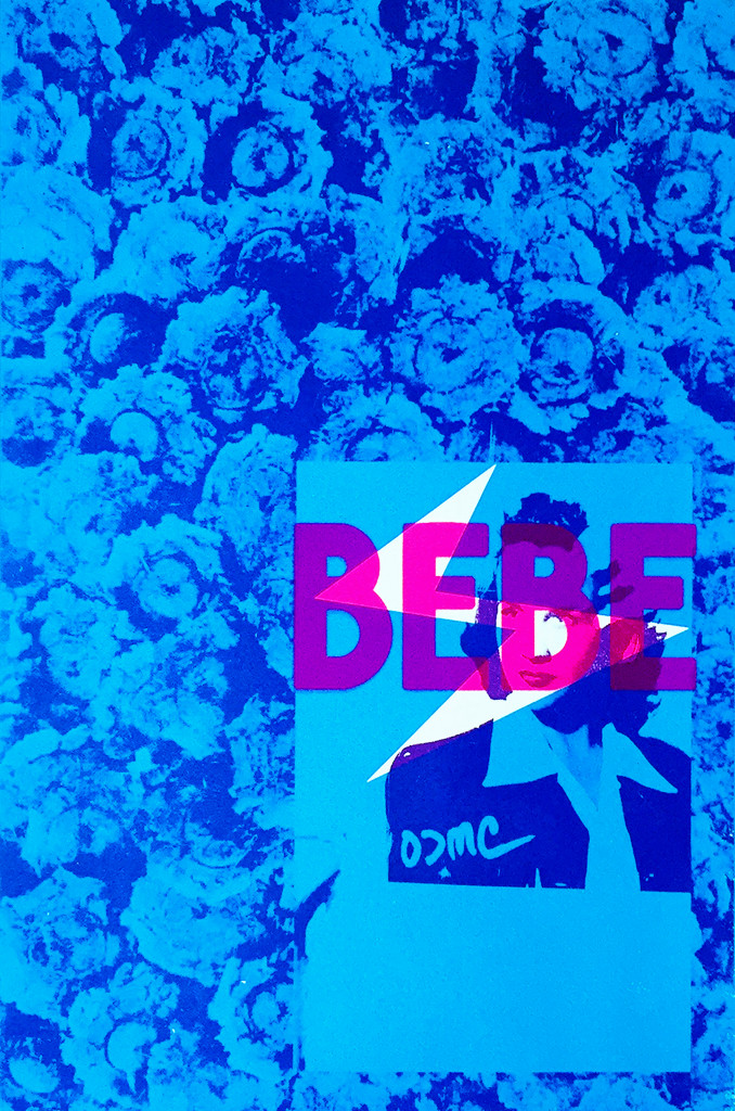
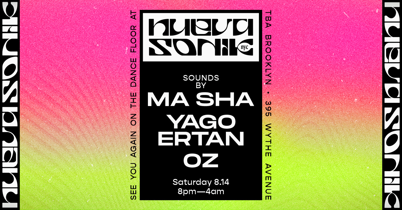
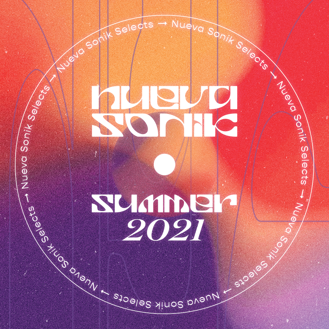
The wordmark uses Erkin, a typeface revival by Cognoscenti Studio inspired by 1960s Anatolian record sleeves—specifically those of Erkin Koray, a pioneer of Turkish psychedelic rock who blended traditional sounds with fuzzed-out guitar riffs and hippie visuals.
At the time, Anatolian revival typefaces were popping up everywhere, but most of them felt soft, sinewy, and kind of delicate—you see them all over Canva now. I wanted something bolder, something with an edge. Erkin felt like the perfect anchor: warm, a little weird, and grounded enough to hold everything else together as the visuals shifted from party to party.

You can’t have a collective without a sticker.
We curated playlists, hosted events, promoted artists’ music, and aimed to have more community programming in the future. Most of the friends involved ended up moving out of New York City (me included, for a brief stint), so we decided to bring everything to a halt. It is my hope to start another event series sometime soon, perhaps a movie club? When we connect people through art and intention, we build community, not just culture. Sharing what you love is contagious; it brings others in and makes space for them to love it too.


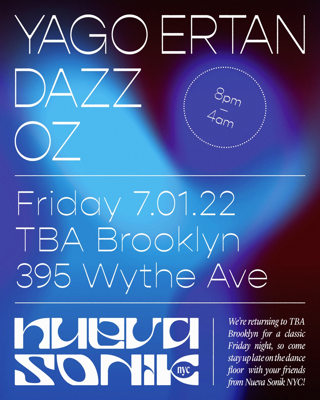
EVENT FLYERS – NEW TO OLD
Party flyers needed to be turned out fast. Building an unpretentious seasonal system was the solution.
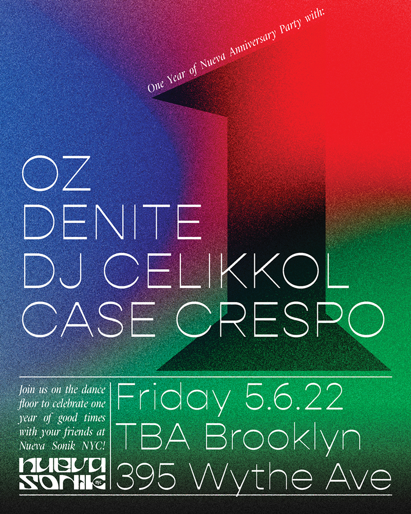
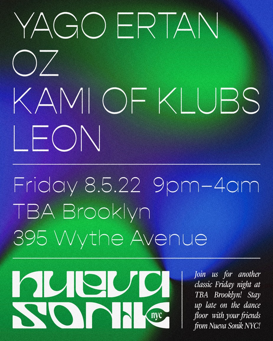
Summer 2022
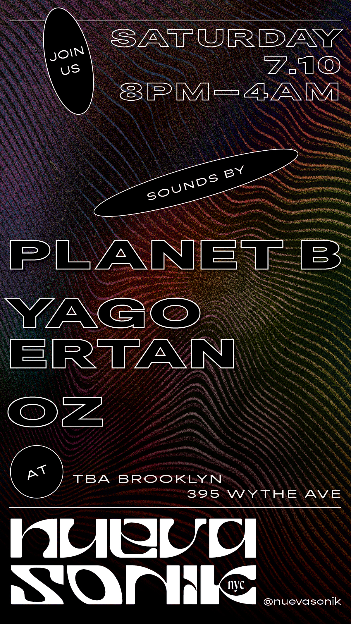
Nueva had just moved houses from a small club to the Water Tower at the top of the Williamsburg Hotel—a glassed-in rooftop bar built inside an old water tower. The energy changed. It was sunset, summer, and everything felt more open—lighter, more melodic. I started shifting the type to something more refined, pulling back from the boldness of earlier flyers. Rooftops to me always meant tribal house, melodic techno, pads, air. I tried to echo that—more color play, more negative space, and a layout with a bit more structure again.
Winter 2021-2022
By then, I had moved out of NYC for a bit and was pulling inspiration from all kinds of places. I also had more free time, so the Nueva flyers became a way to express myself—shifting slightly from just making something functional to spending more time on mood and experimentation.
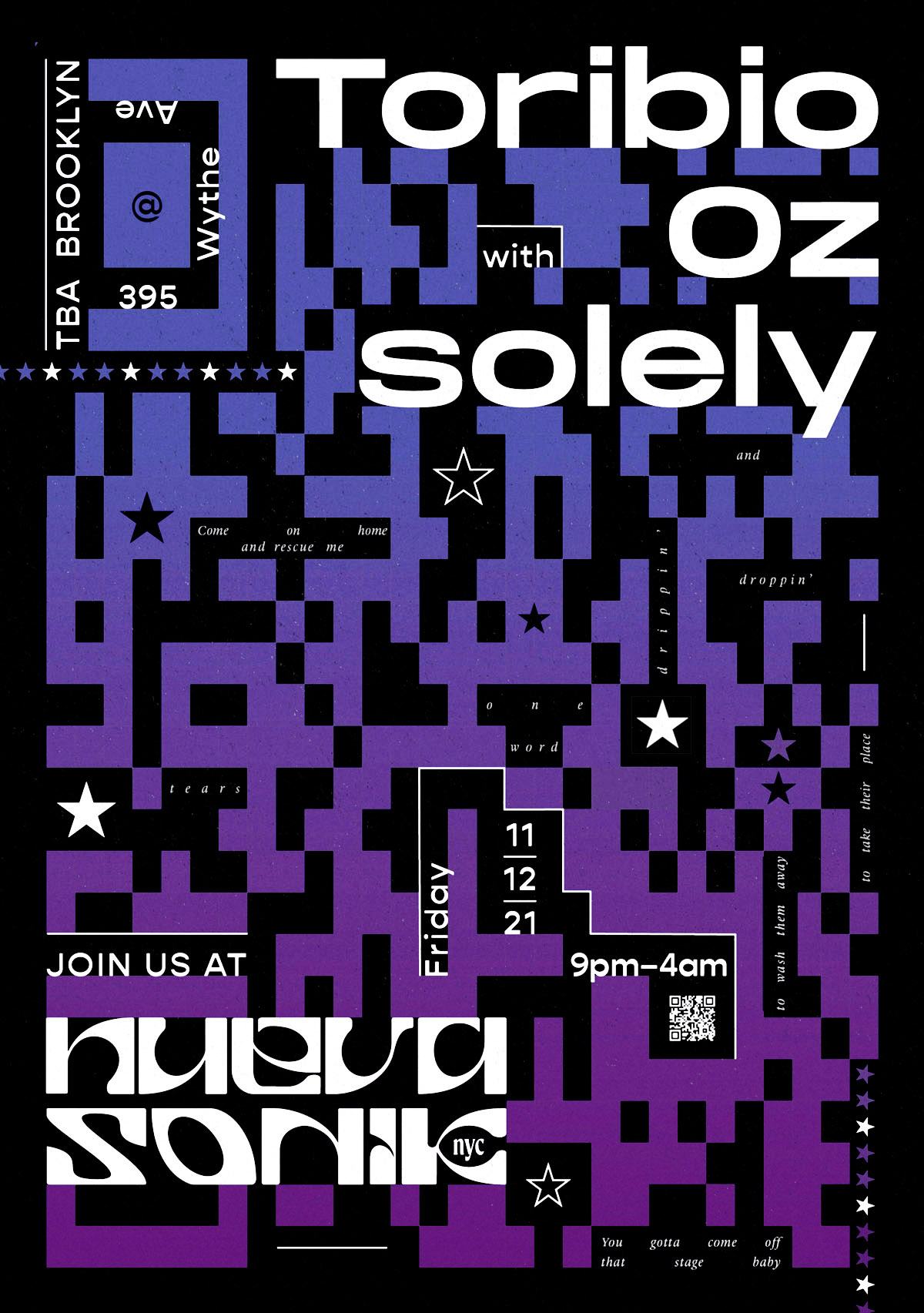
This poster was personal a guilty pleasure. I had just met the Nueva crew in Miami for a festival and was excited to see Satoshi Tomiie live. I was (still am) obsessed with his seminal 90s house track Tears, so I scattered some of the lyrics throughout the design, along with stars that reference the original single cover.
I was also thinking about QR codes—how they’re kind of ugly by default. I’d seen people use them to Rickroll friends (which honestly never gets old), and thought: what if I flipped it? How do you make something “ugly” feel dreamy? I imagined it like a Miami night—gradient skies, electro pixels, stars—and hid the code in plain sight. Scanning the small un-stretched QR code in white on the bottom left takes you straight to ︎︎︎ the song on Youtube.

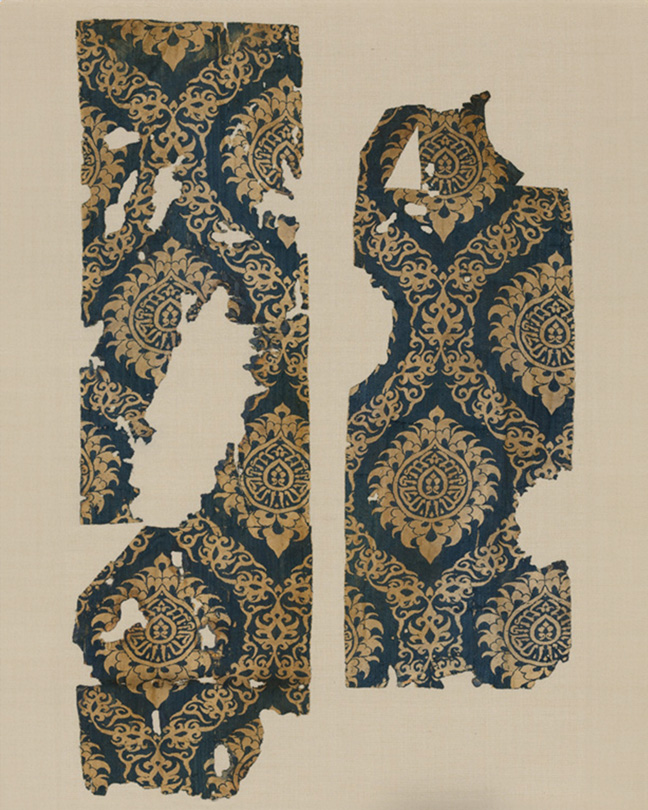
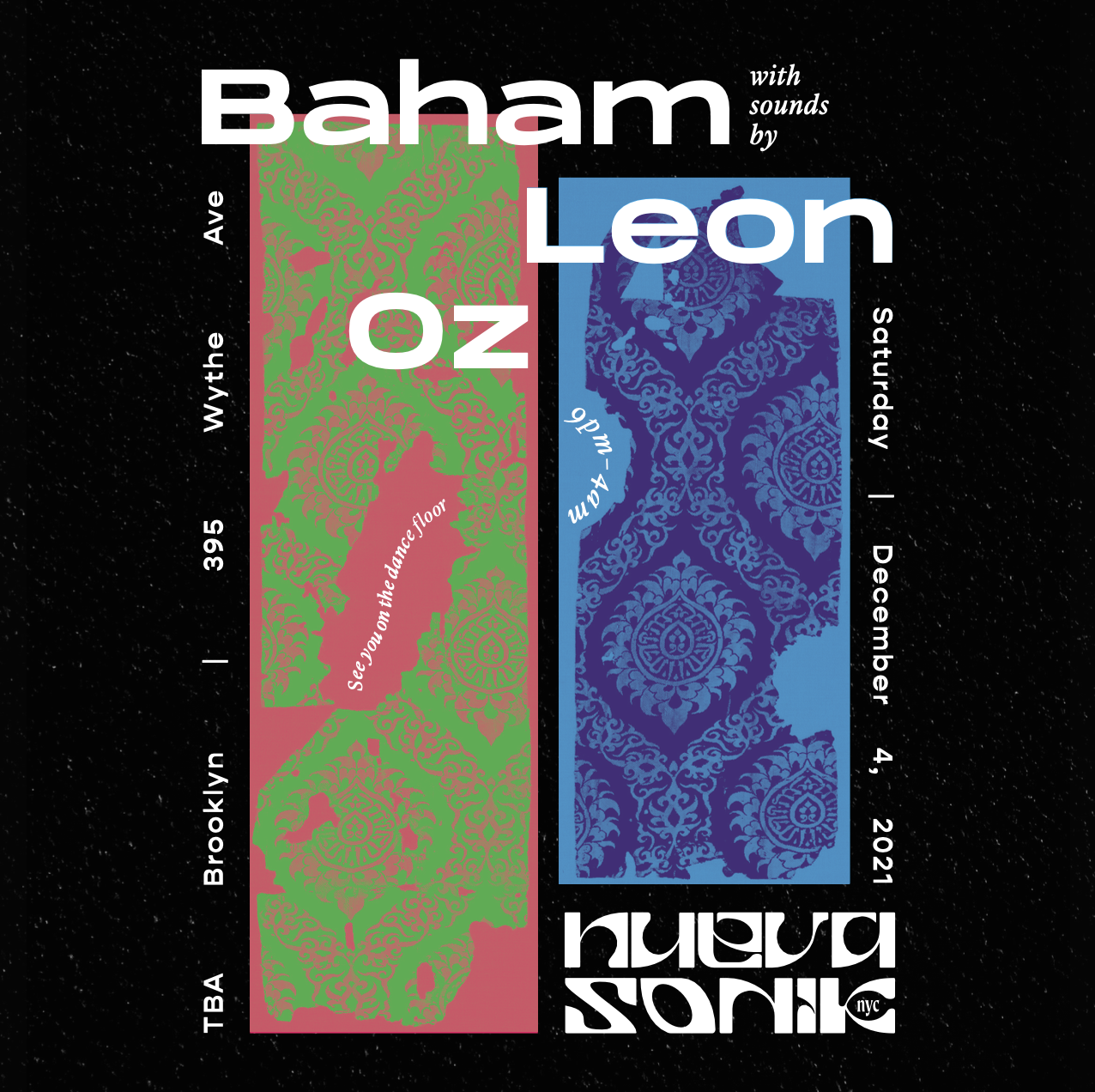
Baham are a Persian electronic group, so I dug into the Metropolitan Museum of Art’s open-access archive for this one and pulled visual references from Persian art and textiles. It felt like a nice way to nod to their background while introducing day-glo colors and keeping it in the visual world of Nueva. I reworked some of those patterns into layered textures that felt both graphic and a little ornamental.


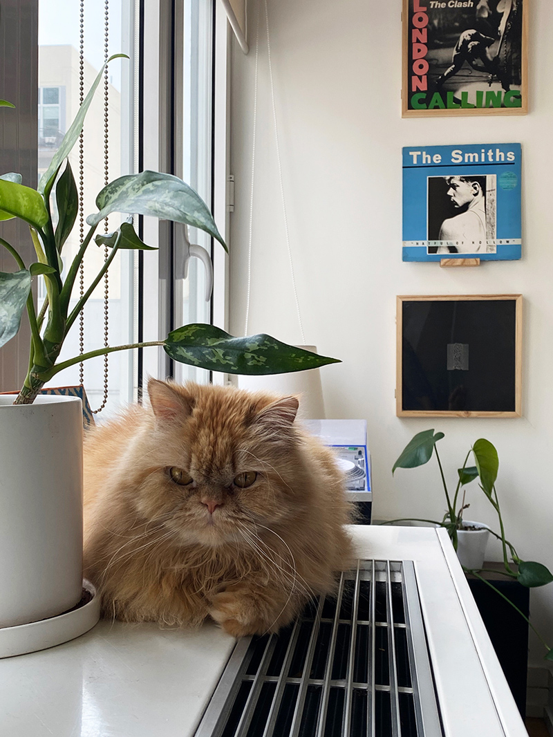
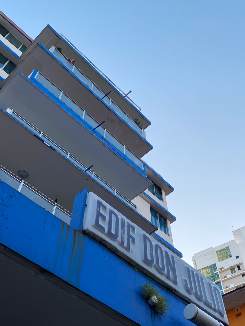
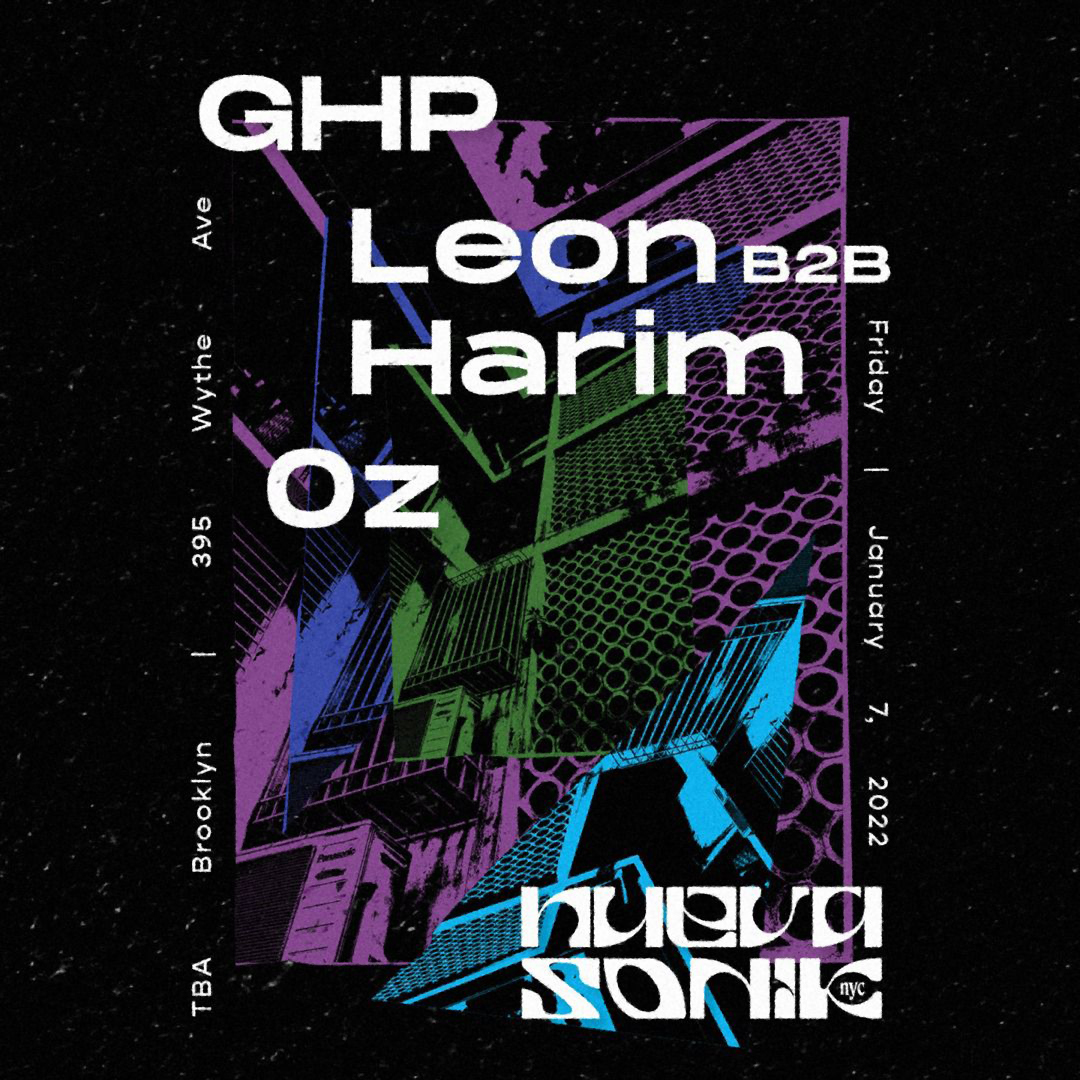
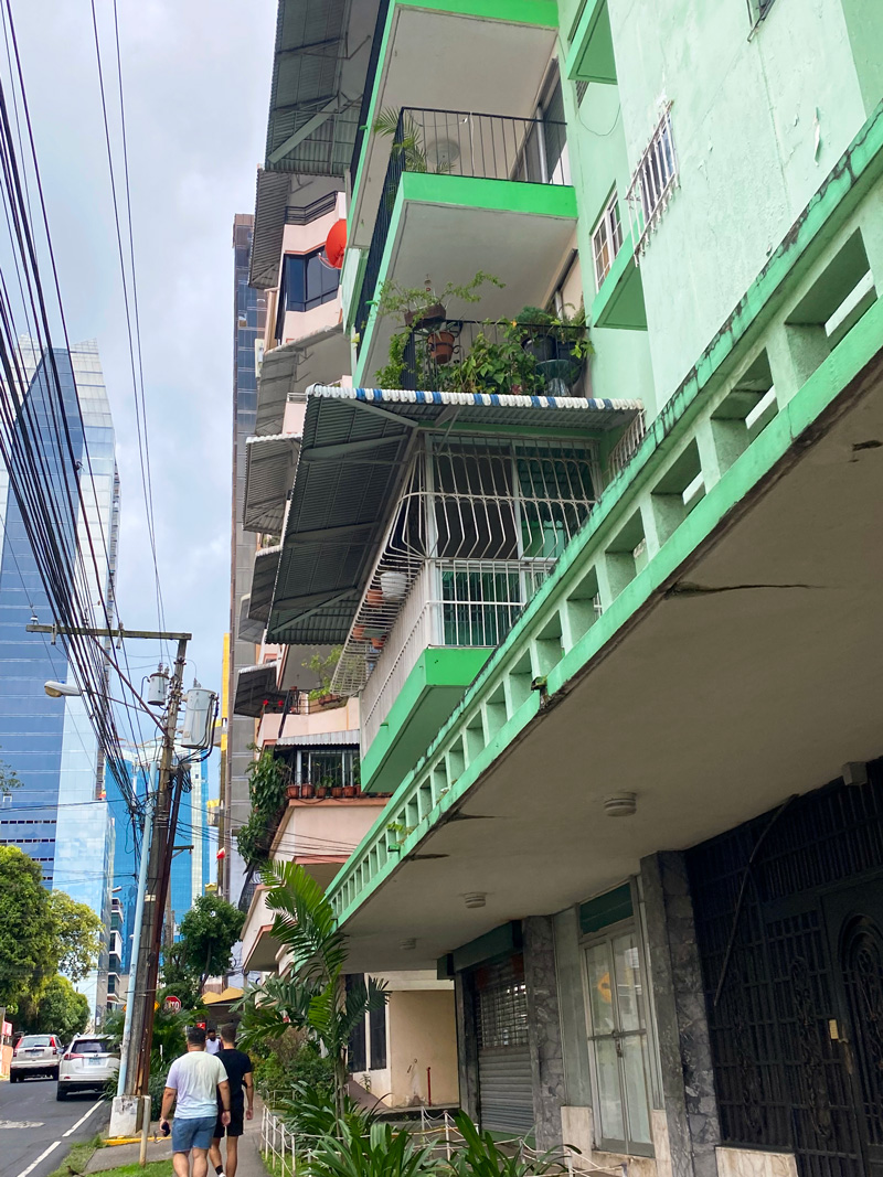
For later flyers, I was collaging shapes into moody compositions with jagged angles using pictures I took around Panama—of my cat, my friends’ dogs, random buildings. I felt isolated from my friends and uninspired, but still had to crank something out. The subjects in the photos ended up looking like lone figures, and the color palettes started getting darker without consciously planning it.
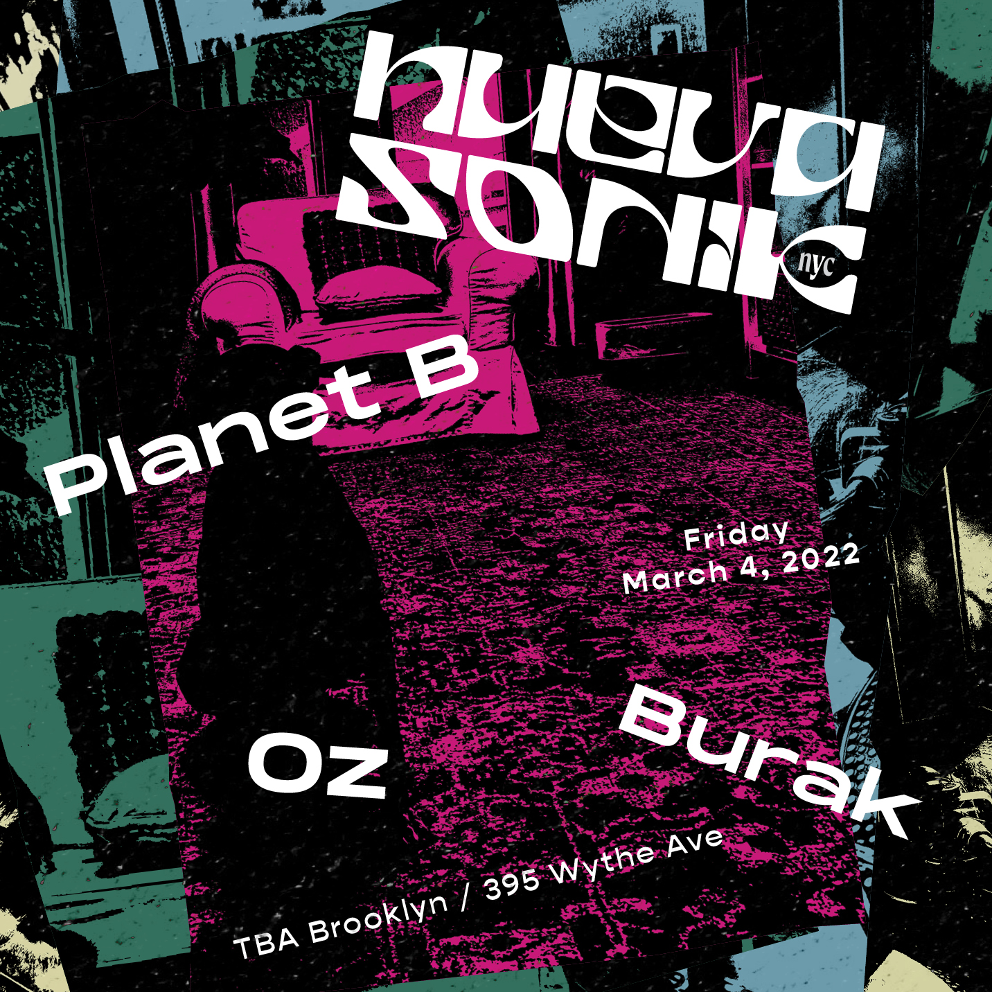
Summer & Fall 2021
I developed a layout that could easily adapt to different formats without losing impact—cropped for Instagram posts and stories, scaled for event pages like Resident Advisor, and used as digital flyers and screens.As we moved into summer, the palette got bolder. Swapping out the gradients gave each event its own energy while keeping the system consistent. The final look felt playful, a little cartoony, and easy to turn around quickly.


The Beginning
Playful, a little dark, and slightly mysterious. Sound waves, retro textures, and moody color palettes inspired the early flyers. We wanted to exist within the ‘edgy’ techno landscape without looking like every other party.