MG GARUZ
Graphic Design
& Art Direction
Hello there! I’m really into...
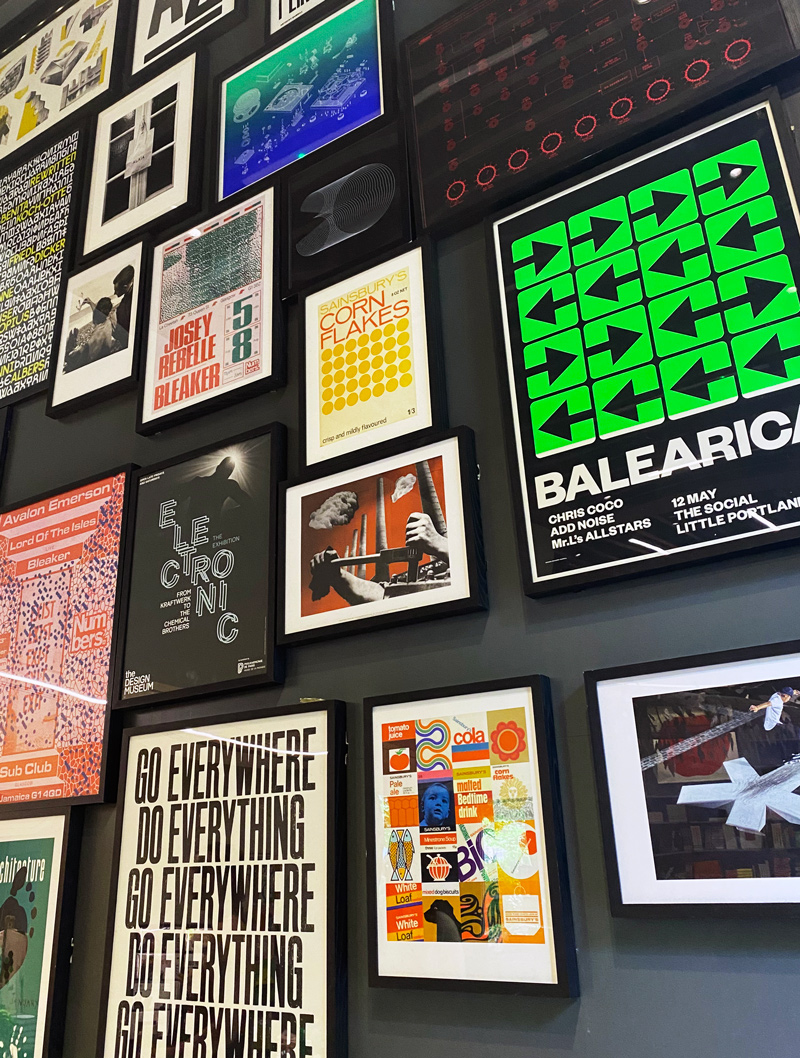
Editorial design and grid systems.
.


B’YACHAD MAGAZINE REDESIGN
Editorial Front of Book
Role
Art Director
Co-Art Director
Jessica Herschler
Editor-in-Chief
Daniel Peri
Creative Director
Don Morris
Year
2019
Organization
Jewish National Fund
Art Director
Co-Art Director
Jessica Herschler
Editor-in-Chief
Daniel Peri
Creative Director
Don Morris
Year
2019
Organization
Jewish National Fund
B’yachad magazine went through comprehensive a revamp in 2019, which included a new logo, a reorganization of sections, new ad dimensions, a new grid, and new typograpic styles. My main contribution was the new grid—which included space for vertical ads on the outer edges of the spreads. Previously existing on a 3-column grid, the new 2-column layout gave the square magazine verticallity which allowed more flexibility when creating side columns and adding display copy.
Fonts in use:
Publico Display and Publico Text(Commercial Type), Compasse (Ryoichi Tsunekawa) , and Gellion (Letter Omega Typefoundry)
The word B’yachad means ‘Together’ in Hebrew and is also the name of Jewish National Fund’s tri-annual publication. Its content centers on the organization’s latest projects and the people they benefit. It has the largest circulation of any Jewish-American newsletter and is mailed to over 800,000 homes each year.


